Data Science Portfolio
Projects developed under AppUp
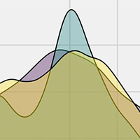
Generated in R + ggplot
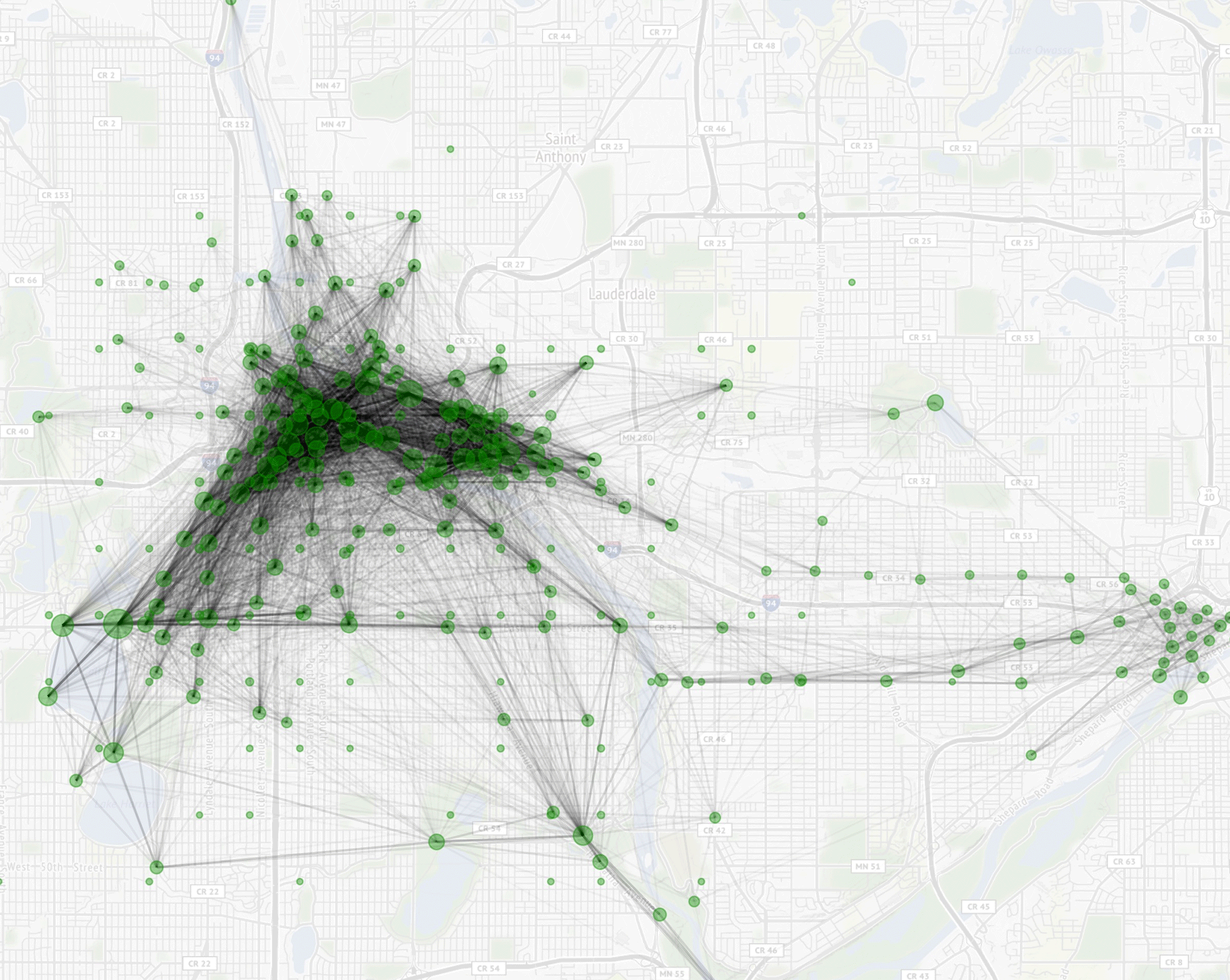
NiceRide Trips Visualized
This visualization was put together to show popular starting points and end points across the TwinCities via the NiceRide bike share. Each trip in 2018 was plot with a line between stations. The darker areas highlight the more popular areas. Visualizing the data in this way also reveals where additional stations may benefit the city.
Generated in R, ggplot, and Rayshader
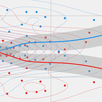
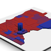
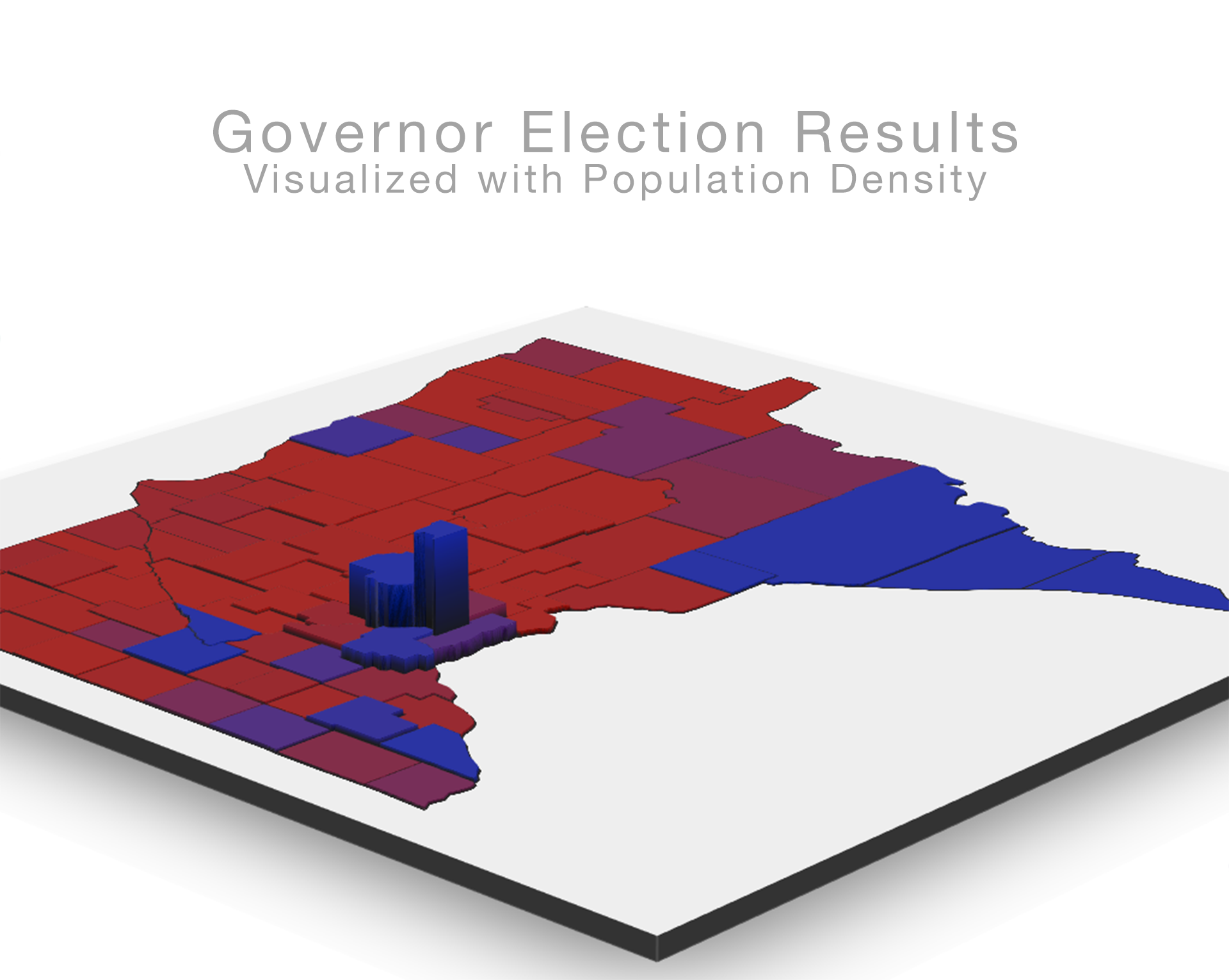
MN Governor Election Results (2018)
In order for me to create this visualization I had to merge existing technology. The data was collected by scraping the New York Times election results page and the 2D plot election results plot was rendered in ggplot. The county densities used for elevation were scraped from Wikipedia, the 2d elevation plot was also made in ggplot. For the interactive 3D portion, Rayshader which leverages rgl, was used.
Generated in R + leaflet
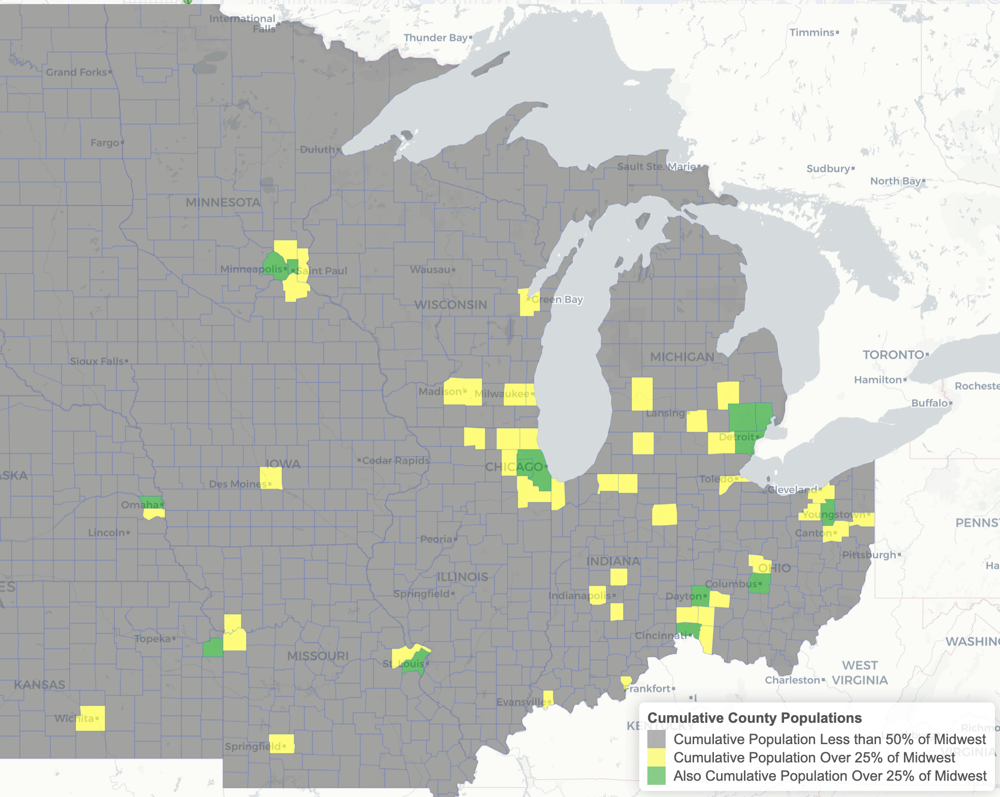
50% of the Population
This plot was made by pulling boundary information for counties in the midwest, along with population data from the Census Bureau.
The plot shows that within the midwest, most of the population lives in or near urban areas. Even by dropping cities such as Springfield, IL or Bloomington, IL the population in midwestern cities surpasses the rural population. Postal code level data would provide greater insight.
Generated in R, igraph, and plotly
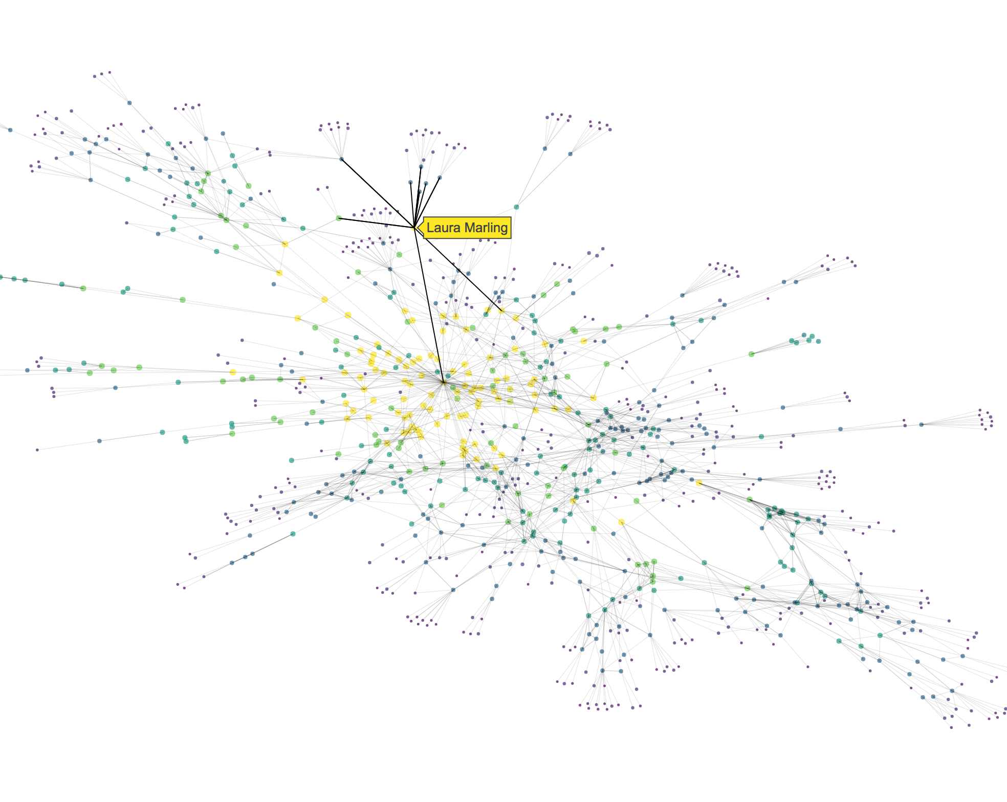
Related Artists Network Map
I created this network map of artists related to Bob Dylan using R, last.fm, igraph, and Plotly. In order to achieve the layout I wrote a custom function for converting igraph objects into plotly network diagrams. I also added additional javascript for path highlighting in order to more easily traverse related artists.
Generated in R, igraph, and plotly
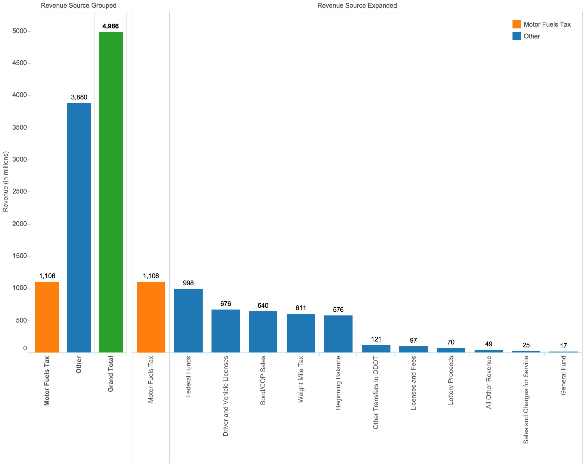
Generated in Tableau + D3
Generated in R + LeafletJS
Generated in Tableau
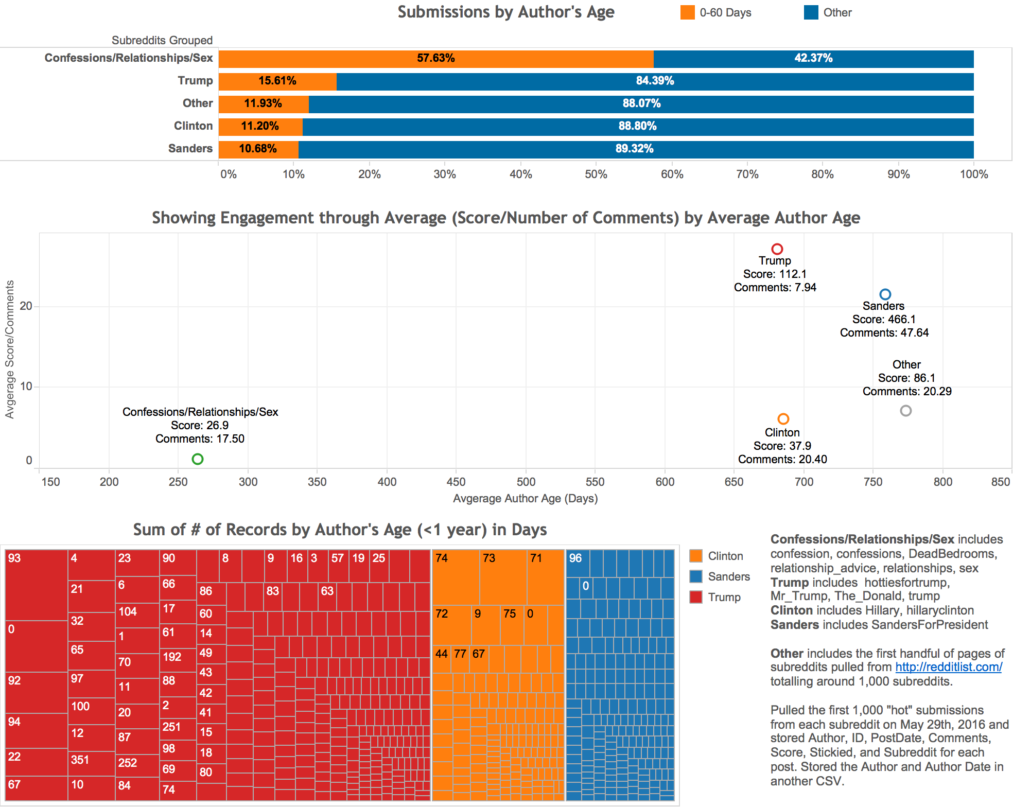
Subreddit Analysis
There was a lot of data to link in this analysis. I started by grouping similar subreddits and used Tableau for my initial exploratory analysis. For the author's age I wanted to show the author's age at the time of submission, so I made a calculated field that returned the difference in the date of the author and the date of the submission.
Comparing political subreddits needed context, which is why the grouping of all other subreddits and subreddits that commonly have throwaway accounts were needed.
Generated in Tableau
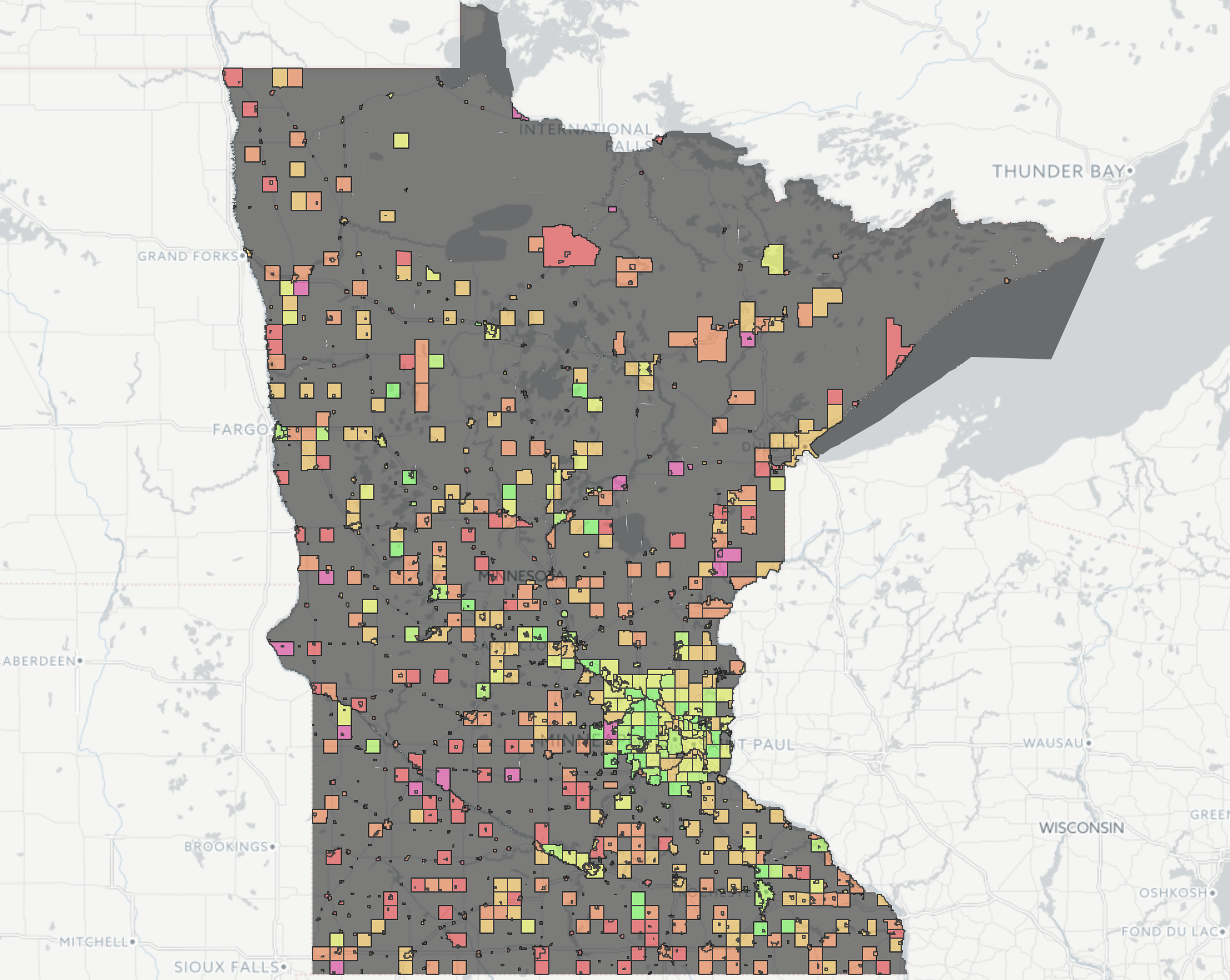
Gas Tax Myth
Created this from the 2011-2013 ODOT data because someone was complaining about cyclists not paying the gas tax where they lived (Portland). Taking into account the damage (1/9,600 the damage of a car, and roads cost a pretty penny to repair) and that many cyclists have cars if not at least a license, (89%) it became clear that cyclists have been subsidizing motorists in Portland. [View Larger]
Generated in Tableau
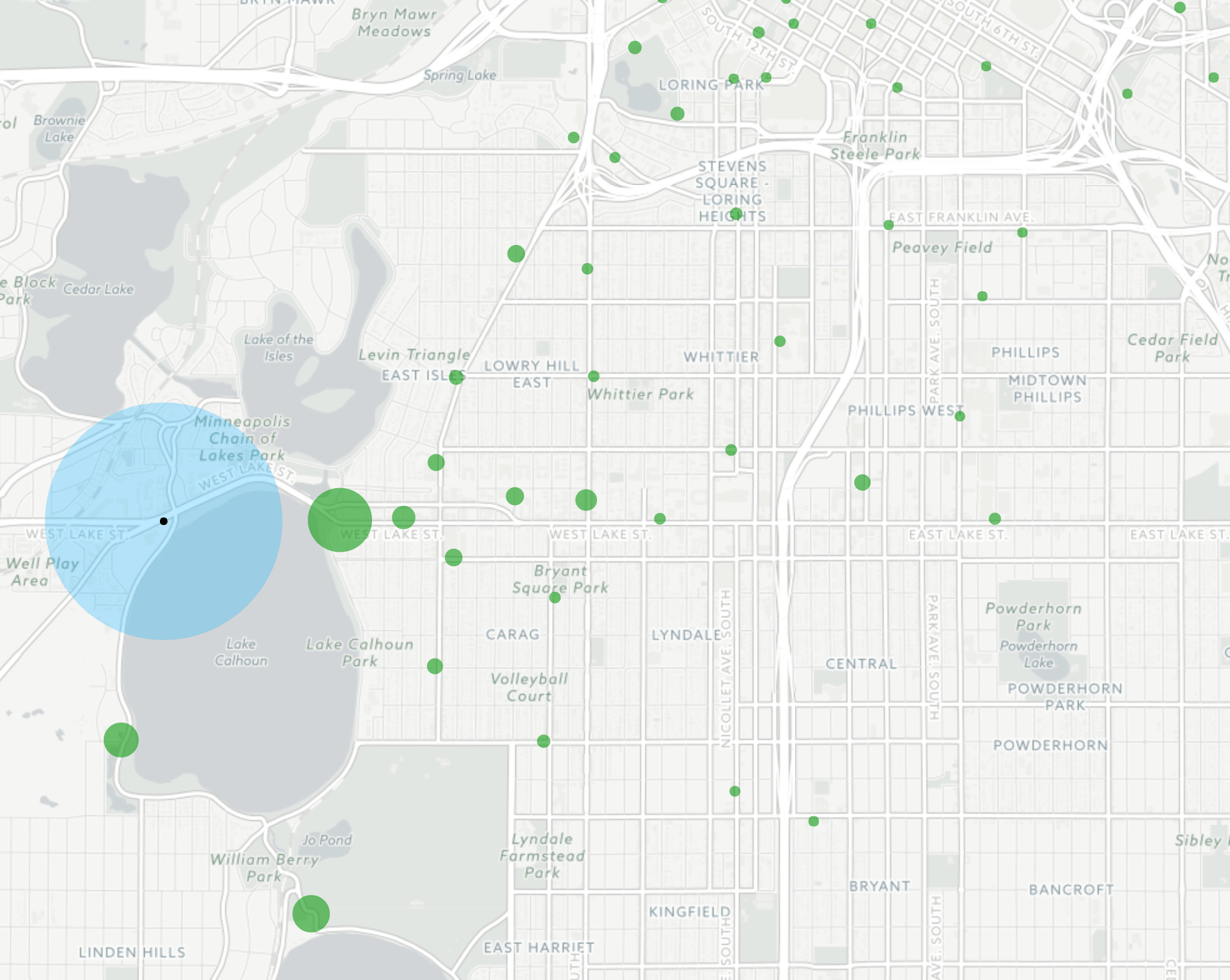
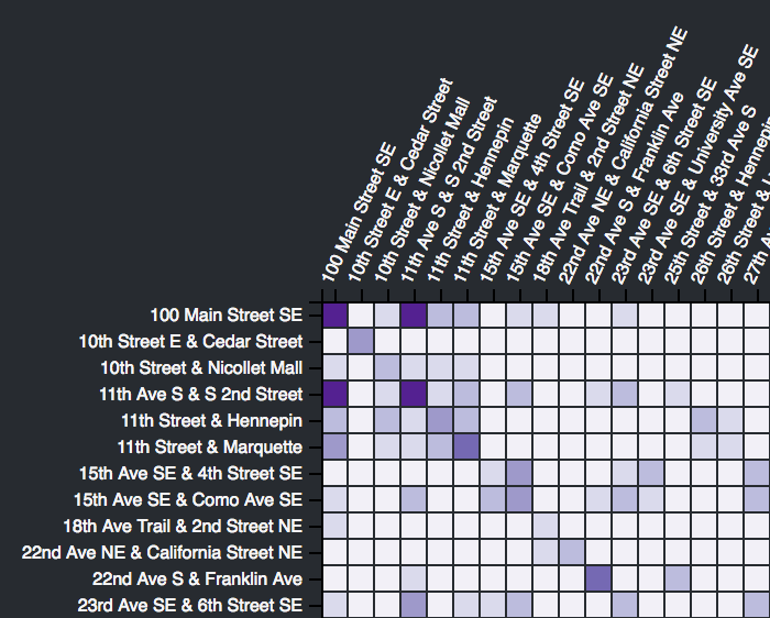
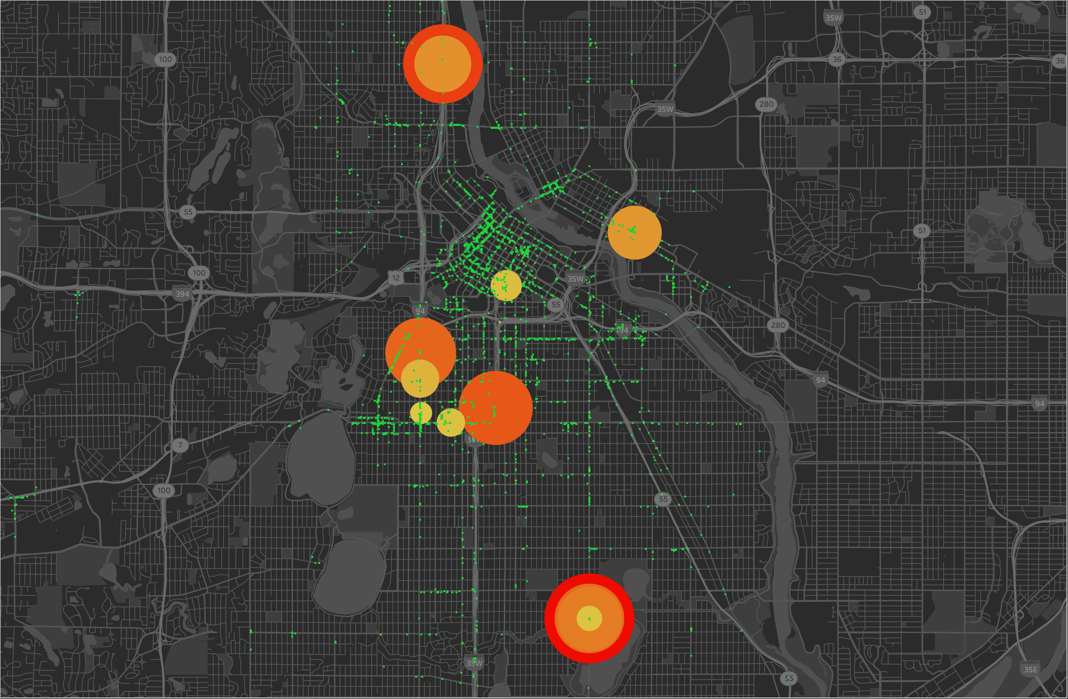
Police Targeted Neighborhoods
Data comes from the 2012 Minneapolis ALPR data inside the date range August 30th to November 29th. For readability's sake any coordinates with fewer than 5 pings were removed. Circumferences increase starting at 51 pings, red is 100 pings, and overlaps are from coordinates very close to each other. The overlap is prevalent in the bottom right with the values 100+80+76+54+9 = 319. I plan on doing a traditional heatmap as well using Google Maps to interactively explore if there is enough interest. [View Larger]